The comptime just gets better and better the more you learn what it can all be (ab)used for.
The build system is another thing that is worth investing some learning time into sooner better than later. I put it off for quite some time, even after I was relatively comfortable with the language, as all I really needed was the default boilerplate, but it also has a lot of really nice features that can make your life easier and projects easier to manage.
Dusk is the current project i’ve been putting countless hours of my free time. Is a statically typed scripting language that i’ve been builting for the last 6 months with a hella fun and also a big learning process in. And i just release ver 0.10 which is a big milestone for me, where i switched from js runtime (using quickjs) to a hand written registered based VM (highly inspired by LUA) with a garbage collector.
I thought I would drop an update because the thread is still alive.
I should probably make a post about it once it’s done.
Currently, it’s actually functional and I love using it every day personally.
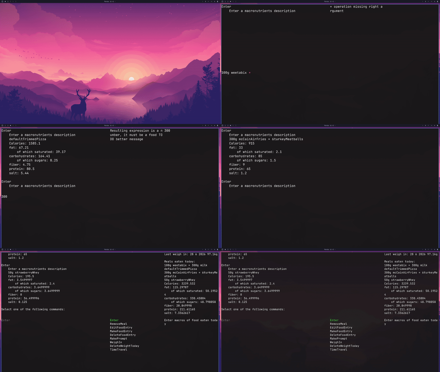
The Idea is you long what you ate with 100% accuracy in seconds if you try to go fast.
The GUI needs a lot of work, which is what I am focusing on now, but you can see a lot of the features working! (The over-engineered fuzzy finder, the syntax highlighting and error messages etc)
The font rendering on this demo is purely MTSDF, however I couldn’t make it look as good as I wanted for small font sizes.
I also didn’t want to take another dependency to do rasterization of .ttf files at runtime. I am now working on having 7 bitmaps (8, 12, 16, 20, 24, 28, 32) and use bitmap font rendering for those font sizes, and MTSDF for the ones higher.
I Also need to find a corner to put my macsot (The dinosaur in my profile pic). I also need to give him a moustache, a hat and a spatula.
Wow, looks super cool, would love to use it in my day to day. I worked on something spiritually similar as my first slightly bigger Zig project - a calorie/exercise tracking server. I was planning to talk about it once the Web frontend for it became a bit more usable and the database schema - a bit more stable, but since I’ve started working in shinier toys in my spare time. Would love to look into seeing if I could use your project as a frontend for mine at some point
The app stores everything in human readable .txt files, also although the app itself will have to be closed source (At least I think it has to be that way, I know other projects you can buy have the source code available, I don’t know exactly how they make it work), I do plan to make a open source library for parsing and writing to those .txt files to make it easy for people to do whatever they want with them (Whether that will be immediately upon release I am not sure, I probably will have to ship it at some point without implementing everything), so it should probably be easy to integrate with anything when it comes out.
I thought multi-channel SDF was called just MSDF, what does the T stands for? Also, what difficulties you have with small sizes? I’ve implemented this once too (sadly I don’t have the code anymore) and it looked good enough for what I needed.
MTSDF is just MSDF but it also has the true SDF distance on the alpha channel. I didn’t use it yet, but the idea is you can later use that SDF to have cool effects like glowing.
My problem with small font sizes was a couple of stuff, ‘t’ for example was 2 pixels thick at fontsize I think 12, where other letters with 1 line were 1 pixel thick. Sometimes I also had a few pixels that were off. For example in font sizes 16 ‘b’ and ‘d’ had a pixel pop out on top. Sometimes I also had letters have inconsistent heights, ‘C’ being 1 pixel larger than other font sizes for font sizes 28. Stuff like that basically, it always looked worse than TTF rendering, and I reasoned text quality is something I should never compromise on for an app that displays mostly text.
IIRC once I’ve fixed fwidth() everything started to look much better. But it’s quite some time already and maybe it was always bad it just wasn’t so obvious with pre-retina displays? I’d probably ask LLM to review shaders, it’s quick and it costs next to nothing.
EDIT2: I remember that there were some reasons why I was not 100% happy about using (M)SDF but that was mainly about foreign languages and other detailed glyphs, english characters always looked fine.
I think it depends on what you mean by “fine” because it does become a bit subjective. It’s something I showed to many people, some people told me MTSDF looks fine.
Personally, I am not happy with how characters look in the demo I provided, it feels like some characters are a pixel off.
I think what I ended up doing is similar to what was described in the link (thanks for the link btw, it was a good opportunity to try to learn more shading, In general, learning about the shader was rough, I couldn’t find a quality source to learn about how to write the shader.)
LLMs did a poor job on code (shaders included) IME, I was not opposed to using them, but they just never delivered code that was up to my standards and I quickly re-wrote anything they gave me, the project ended up hand crafted by accident as a result.
At least Claude was the only one that admitted that it didn’t think it could fix the problem.
They were really good for tutoring and teaching me how the GPU and SDF works, and also for brainstorming Ideas about the user experience and the design of the app, and they really helped me there.
I think the issue here, is that running the shader we get the MSDF distance, and for some pixels it’s over 0.5 in places where it shouldn’t be (I tested that when I just used step() as my anti-aliasing), and I think no matter how smart my anti aliasing technique is, it can’t fix that.
I rarely use LLMs to write the code, but I use them a lot to review my code and to look for bug/mistakes and root causes. Obviously different people have different experiences but it works for me (local Qwen 3.6 27B).
The issue you describe really reminds me the fwidth() bug I’ve been having myself. IIRC it’s important to use it properly because modern GPUs split the work across many tiles, and those are then computed independently, and fwidth() is (I hope, it’s been a while) the way how you can compensate for any tiny precision errors that could then accumulate.
Also, I think font kerning applies even if you have fixed-width fonts. I suppose you don’t do that?
Yes I didn’t do kerning, I wanted everything to be a perfect grid, I dislike it when different characters have different widths so even with MSDF I made it such that I define a grid of integer coordinates and render each character inside a cell.